Hi All,
First thanks to all the many people who have contributed to this area, seen some great ideas and helpful hints.
My research team are users, having very little computer literacy among them.
What I have often longed to have understanding and time to do is change the appearance of our app to make it arguably more visually appealing. Yes standard features in Knack allow for background colors but the interface between background and foreground send challenges to the person controlling the look and feel.
Below are three things I have implemented and (x fingers) found no issues across the board.
1. STICKY TABLE HEADER ROW ON MAX WIDTH TABLES
I had found some great hints about this searching “sticky header” but at the end of the day when you use Max width for your app the suggested coding failed dismally.
Stack Overflow to the rescue as it appears this topic is not just knack related but JS environment related.
The work around is really quite simple and is a 99% solution.
99 per cent because on the first row of the table it leaves a small gap between the heading row and the first row of data. I can live with that !
The long and the short of it is, the z-index in Knack by default is set to auto.
This mean that in many cases the table column headers are in a transparent state and as you scroll the table get lost mixing in with data below. Worse if you have an embedded image displaying or have changed the background color for a column the title disappears completely.
/ fixes the ridiculous table header row labels being not displayed or overwitten /
thead {
position:relative;
top:-10px;
z-index:5;
}
By setting a specific z-index rather than auto you can basically override how it is being displayed and by offsetting the top by -10 pixels it works out really nicely even when scrolling.
ORIGINAL VIEW - NO MOD

AFTER MOD IMPLEMENTED

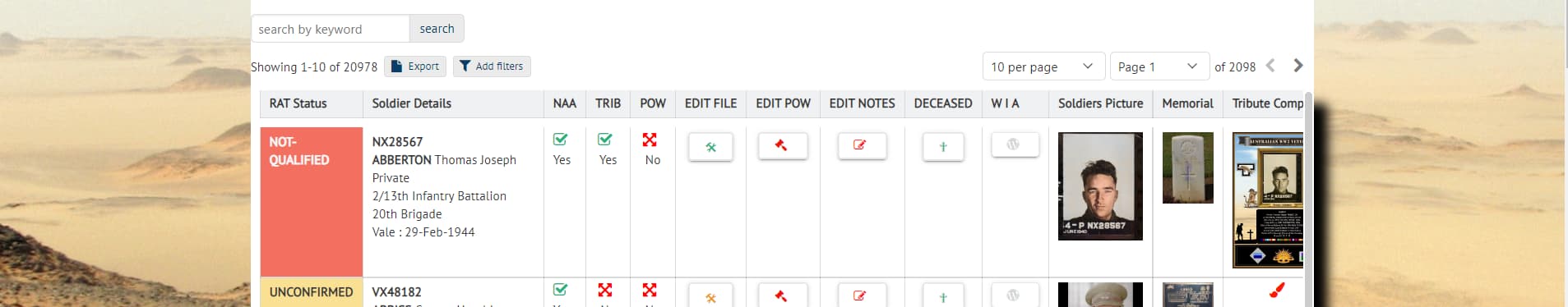
2. BACKGROUND IMAGE ACROSS THE SYSTEM
This is where visual appeal to my users comes in, gives them more feeling for an environment they are working in rather than the somewhat bland normal forms menus environment.
its a simple mod and note IT APPLIES TO ALL SCREENS INCLUDING THE LOGIN PAGE though the image gets truncated on that page. The only thought you have to give is to how big it should be to support the app screens you have designed otherwise you have repeating images (I have an image sized at 2000 x 1200 which is kind of hefty size wise but works without any noticeable drain).
This image gets set in CSS using kn-content.
.kn-content {
background-image: url(“https://…/…/desert.gif”);
}
STANDARD VIEW - STANDARD BACKGROUND COLOR SET

REVISED VIEW - BACKGROUND IMAGE ADDED

Okay that works for me, an appropriate image related to our database. BUT…
Depending on the strength of your background image you may lose clarity of your data in the table and that is not something that can be tolerated for the sake of a “pretty background”.
So you need to add into CSS an entry to set a standard background color for tables.
.kn-table {
background-color: #ffffff;
}
AFTER CODE HAS BEEN ADDED
WARNING.
IF you use anything other than ffffff (white) this color will also translate onto detail screens in modal popups and looks horrible. It also makes the entire table area including the search box , title etc that colour.
EXAMPLE IF NON WHITE CODE USED IN TABLE BACKGROUND ABOVE

Quick way to solve this is making the previous table mod code (note the -table added)
.kn-table-table {
background-color: #e0ccaa;
}
By doing this you limit the colour purely to the table data area only, i.e the rows and columns. Search and filters etc will just sit as part of the background scene quite happily and popup modals return to normal.
TABLE SCREEN/NON WHITE BACKGROUND CODE SET

TABLE SCREEN AFTER “-TABLE” ADDED PER ABOVE

MODAL POPUP NO LONG REFLECTS ANY CHANGE TO BACKGROUND COLOUR

3. BACKGROUND IMAGE WITHIN THE TABLE (rather than using a color)
When this worked I almost spilt my coffee ! I saw a post where someone had shared his code trying to change the background of a table but somewhere along the line he had complicated things. It may have been an old post but I borrowed 3 simple lines that looked like the CSS portion and it worked.
This gave me control over the specific table such that I could use another image as the background, again something relevant to our work.
#view_618 .kn-table-table {
background-image: url(“https://…/…/old_paper_texture2.jpg”);
}
BACKGROUND IMAGE ADDED TO TABLE DISPLAY

This may not suit many - graphics are often regarded as unnecessary overheads.
But for my application and with a common interest volunteer user base, I believe it kicks a goal in making our application less bland and visually appealing
Cheers